Five ways to improve your call-to-action buttons on your small business website
It’s nearing the holidays season, and it seems everyone is already online searching for gifts or deals that are too good to pass up. If your small business is one that’s offering holiday deals and magical downloads to help your ideal customer, paying attention to your call-to-action (CTA) buttons is one of the easiest quick wins you get right now! Unlike a hyperlink that’s easy to skim over, a CTA button grabs people’s attention and prompts them to do something now.
But all CTA buttons are not made equal. It’s easy to think that more is better or just stick these buttons every few paragraphs and call it done. Unfortunately, that’s not likely to produce the results you want. Here are five quick ways to get better results from your CTA buttons.
Here are some great CTA examples:
Curious? Keep Reading
See what happened next
Watch this video before it expires
See the difference
Save your seat
Count me in
Send me the free stuff
Download your guide
Schedule your call
Display them loud and clear
CTA buttons work most effectively when placed under or to the right of text. They need to be big and bold compared to the rest of the page’s text and should ideally use a vibrant color that contrasts the rest of the page (while also staying on brand). A great example is this ‘start trading’ CTA button on this forex trading site. It’s large size, central position and blue color immediately draws your attention to it. I tend to use purple buttons throughout my site to draw attention but also stay within my branding guidelines.
Create a sense of urgency
The text you use on your button is more important than you think. Ideally, you want to create a sense of urgency. If your website is for a restaurant and you want people to book tables, don’t label your CTA button ‘table bookings’ - instead consider ‘book a table now’ or ‘see available tables’. Words like ‘now’ and ‘today’ emphasize immediacy, while phrases like ‘available’ and ‘while stocks last’ suggest that there’s limited time or products left. If you can incorporate some sense of ownership, this is also a good strategy. For example, "‘download your free guide’ instead ‘my free guide’ helps your audience understand that you are talking to them!
Don’t overdo it
Buttons are most effective when there are one or two of them per visible section of page. Displaying too many buttons at once will make your site look cluttered and each button won’t have as much of an impact because there are so many of them. You don’t want to overwhelm your reader with choices. If you do use more than one button per visible page, make these buttons different shapes or different colors so that they stand out from one another.
Use A/B testing
When playing around with the design of your website, it’s worth using A/B testing to find the best layouts, colors, sizes and text for your buttons. A/B testing involves creating two slightly different versions of the same webpage (in the case of CTA buttons, the buttons would be different on each page). By running two identical advertising campaigns - each one leading to a different page version - you can then use analytics to work out which page encourages more people to click on the buttons. From this, you can work out the best way of displaying buttons to generate the most amount of clicks.
Make sure they’re mobile-friendly
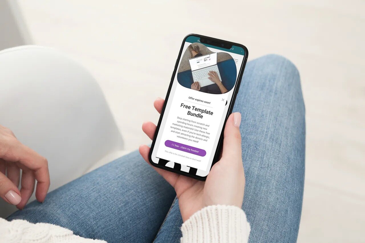
When people view your site on a mobile device screen, you may want to make sure that the buttons display differently to how they would on a desktop. Ideally, the buttons need to be much bigger on the mobile version of your website - this is so that mobile users can easily tap on these buttons with their finger. Any text on the button may also need to be larger so that it can be more easily read. At the same time, you don’t want the buttons to overwhelm the small mobile screen. Be sure to test out the view on multiple devices before you hit publish!
It’s important to also note that your call-to-action buttons need to align with the goals of your website. For example, if you really want people to book a call with you before they choose a service, that’s the primary call-to-action you want to use throughout your site. Or if you hate getting phone calls, don’t use the Call Us Now CTA. Instead, encourage people to complete a an inquiry form or stop by your store.
When used correctly and with some strategy in mind, your CTA buttons have the potential to make your website your best salesperson ever. Take some time to review your CTAs right now before the last minute online shoppers are done. Start with your homepage and make adjustments as needed. Slowly, you can move on to the rest of your website or your most viewed pages and continue to tweak until your entire site has the right CTAs on each page and you’re getting the results you want.
Until next time,
Andrea

Plan, post and measure your way to blogging success!
Do you want to start blogging more in 2021? I’m sharing all my blog secrets to help you plan your posts, write about topics that people want to read, and measure your success! Plus, I’m giving you blog prompts for an entire year so you don’t even have to think about what to write!
One Nine Design is a digital marketing company helping small businesses and nonprofits learn how to use the right digital marketing tools to grow your reach and make a bigger impact!