Using Effective Banner Design To Boost Attendance At Fundraisers And Community Events
For organizers of fundraisers and community events, using banners can make all the difference between success and so-so results. Banners remain one of the most effective, affordable, and visually appealing means to achieve promotional goals.
The secret to success starts in design, well before the banner is hung. Effective banner design results from understanding a few design principles, having an educated eye for layout, and leveraging modern technology.
The Rule of Thirds in Banner Design
The design principles outlined here apply to many forms of advertising, especially attention-getting banners at fundraisers and community events.
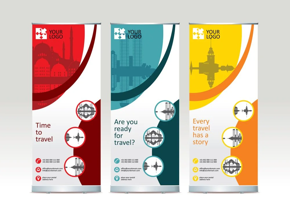
The rule of thirds is a method used in layout that the human eye recognizes as pleasing visual design. Historically, it’s been used in sketches, paintings, photography, and business signs. It’s considered a type of composition and can be applied to banner design to give it a professionally crafted appearance.
To understand it, mentally divide an image into a grid of nine spaces, two parallel horizontal lines, and two parallel vertical lines. Picture a tic-tac-toe game layout. The main image should not be centered in the middle square; rather, it should be either right or left of center. Key elements should be spot on an intersection of lines, rather than in the center of any of the resulting squares. Headline text that you want to be noticed should sit atop one of the horizontal lines.
It’s helpful to get out a piece of paper and a pencil, and map out the design with the grids drawn, which will give you a good picture of how pleasing this rule-of-thirds layout is.
For example, let’s say you have an idea to place a sun with multicolored beams stretching out from the center. Using the rule of thirds and your rule of thumb, you wouldn’t place the sun smack dab in the middle of the banner. It would be much more pleasant, design-wise, to have it off-center, with only about 75% of the sun in view. Other elements, including text, can be placed around, behind, or in front of it, adhering to the rule of thirds. Text would be in front, and other visual elements might peek out from behind the sun.
Color and Banner Design
A color palette should be chosen that aligns with the organization’s brand. After all, banners are a great way to spread the brand’s awareness, and the colors used should make sense to the event’s visitors. Sometimes, the color alone sparks an awareness of what brand it is. Take some of the most iconic brands in the U.S., like McDonald’s or Walmart. When you’re driving and seeing those colors on signage in the distance, you automatically recognize the brand, even before reading the words. Yes, the symbols – the yellow arch, the sun icon – help too, but they aren’t the only brand signals.
With special events like fundraisers and community events, there may be other colors you can incorporate that will convey the purpose of the event is about. If you’re having an outdoor petting zoo, for example, you might want to incorporate brown and green into the banner. If it’s a community food drive, the color green is often associated with fresh food, also accompanied, perhaps, with orange.
So, you could have your organization’s brand logo in its branded colors, and the text in a color palette that conveys what the event is about. A racing event might have red; a celebrity-hosted event might have starry gold or yellow – you get the picture.
QR Codes to Bring Visitors Home
The use of QR codes in advertising is so ubiquitous now that it’s easy to incorporate them into your banner design without making the design overly complicated. People will know exactly what to do with them without you having to explain anything. In other words, you don’t have to have any accompanying text saying, “For more information, scan this code with your phone.” Excellent print quality on fundraising, food drive, and seasonal church banners allows the QR code to be kept relatively small in order to be clearly and readily scannable by a person’s smartphone.
You can have the QR code lead the person back to your organization’s website, where you can have more information about your organization, about the event, or even as a lead magnet, where you capture their email for the purposes of future marketing. It’s up to you.
The best part about using banners for fundraisers and community events is their long-lasting purpose. Bought once and designed thoughtfully, they can be used over and over again, providing value that lasts through the years.
Author bio: Drew Trotman has owned and operated PraiseBanners for 35 years. His company designs and prints banners for worship spaces, as well as clerical paraments and vestures for churches. He leads a staff of more than 25 people, including designers, seamstresses and finishers whose goal is to ensure that your worship space is beautifully inspired.