When Product Images Need to Do MoreThan Look Good
As a designer, I often work with clients who assume their images are “good enough.” They have photos, they look professional, and nothing appears obviously broken at first glance.
That assumption usually holds until customers start asking basic questions. Or choosing the wrong option. Or hesitating right before checkout. None of this feels dramatic, but it adds friction. And friction, especially online, is where decisions quietly fall apart.
Not long ago, I worked with a small business whose products were genuinely well made. The issue wasn’t quality. It was communication. The imagery was attractive, but it didn’t clearly explain size, structure, or variation. Customers weren’t confused in an obvious way. They were uncertain. And uncertainty slows everything down.
After a few targeted changes to how the products were shown, something shifted. Fewer questions came in. People spent less time jumping between pages. More visitors moved forward without needing reassurance.
Why Visual Clarity Is Part of User Experience
Most people don’t read product pages carefully. They scan, glance and compare. They look for signals that help them decide whether to keep going or move on.
If what they see answers their questions quickly, the experience feels smooth. If it doesn’t, the mental effort shifts to the visitor. And when users have to work harder to understand something, many simply leave rather than push through.
Clear imagery reduces that effort. It replaces long explanations with immediate understanding and supports people who don’t want to read every word. In that sense, images aren’t decoration. They’re part of the user experience, just like navigation or layout.
Where Things Quietly Break Down
Most issues aren’t obvious mistakes. They’re small inconsistencies that accumulate over time. Slight changes in angle from one page to the next. Lighting that subtly shifts. Variations that aren’t shown side by side or in a comparable way.
Each of these details seems minor on its own. Together, they make comparison harder than it needs to be. Users may not consciously identify what feels off, but the hesitation is there. When people hesitate, they slow down. When they slow down, they’re more likely to leave.
How Clear Presentation Reduces Questions Before They’re Asked
One of the most practical benefits of improving how products are presented is what stops happening behind the scenes.
When people can clearly see what’s included, how options differ, and how something is used or assembled, they don’t need to double-check. They don’t send emails “just to be sure.” They don’t pause and come back later with doubts.
For small teams, this matters more than it might seem. Fewer clarification requests mean less time spent repeating the same answers and more time focused on meaningful work.
Why Consistency Builds Trust Quietly
Inconsistency creates subtle friction. When scale, framing, or lighting changes from page to page, users have to mentally recalibrate before they can compare options. Some will do that work, but many won’t.
Consistency, on the other hand, feels calm. Predictable. Reliable. People may not consciously notice why, but they trust what they’re seeing more.
This is where approaches like photoreal product rendering can be helpful — not as a visual upgrade, but as a way to keep product presentation stable, accurate, and comparable across an entire site, even as product ranges grow.
Showing Details Without Over-Explaining
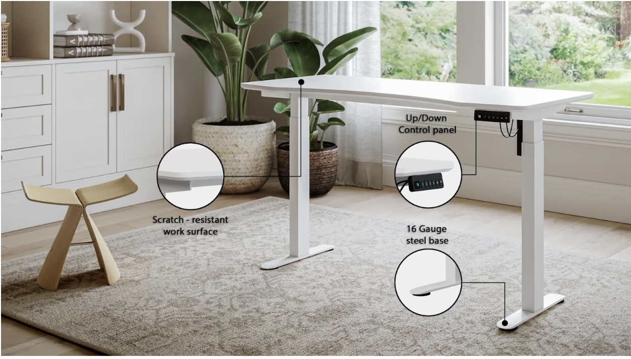
Some aspects of a product are simply hard to communicate with standard photography. Internal components, subtle material differences, or modular options are easy to miss or misinterpret when context changes from image to image. When those details aren’t shown clearly, people fill in the gaps themselves, often incorrectly. That’s when misunderstandings happen.
Purpose-built imagery allows those aspects to be shown intentionally, without relying on long explanations or assumptions. The image carries the information instead of the paragraph.
A Simple Way to Evaluate What You Have
If you’re not sure whether your current images are helping or hurting, try this simple exercise.
Open one of your product pages and ignore the text for a moment. Ask yourself whether you could understand what’s being offered, how it works, and how it differs from other options just by looking. If the answer is no, you don’t necessarily need more images. You need clearer ones.
Final Thoughts
The goal of product imagery isn’t to impress. It’s to explain. When images are treated as part of the user experience rather than decoration, they quietly do their job in the background. They reduce uncertainty, build trust, and help people move forward without needing extra reassurance.
And in most cases, the best visuals are the ones nobody comments on at all — because everything simply makes sense.

