Best Places to Use Stock Photography Across Your Website for More Impact
Stock photography can do much more than fill empty space on a website. When used thoughtfully, it can shape first impressions, reinforce your brand, support your messaging, and make your pages feel far more polished. The key is not simply adding images wherever a section looks bare. The real value comes from placing visuals where they can strengthen the experience and guide visitors through the site.
That is why the question is not just whether to use stock photography, but where to use it for the most impact. A strong image in the right place can create trust, add clarity, improve flow, and make your website feel more intentional. A random image in the wrong place can do very little, or worse, make the site feel generic and unfocused.
If you want your visuals to work harder for your brand, it helps to know which parts of a website benefit most from thoughtful image placement. Professional stock photos are not just attractive; they are also effective. They support a purpose. They help tell your story, break up heavy content, and create a better balance between design and communication.
Why Placement Matters as Much as Image Quality
A website can feature beautiful photography and still fall flat if the images aren't placed with any real intention. Different pages and sections serve different purposes, so the same photo that works perfectly in one spot might feel completely out of place somewhere else. A homepage hero needs to set the tone fast and pull visitors in. A blog featured image needs to make the content feel worth clicking. An about page image needs to do something a little harder: build genuine connection and trust.
When stock photography is used thoughtfully, it becomes part of the user experience rather than decoration layered on top. It helps clarify what matters on the page and shapes how the content feels before someone reads a single word. That matters a lot on modern websites, where most visitors are skimming long before they're actually reading. Research from the Nielsen Norman Group on how image placement affects user experience confirms what most designers already know intuitively: a strong visual in the right spot guides the eye and creates an emotional shortcut that supports your message, but only when it's placed with purpose.
Thoughtful placement also makes your site feel more consistent. When photos aren't just scattered around to fill space, they start to feel like part of a system. That's where the real impact comes from — and it's exactly why a content-first approach to website design makes such a difference before you ever start choosing images.
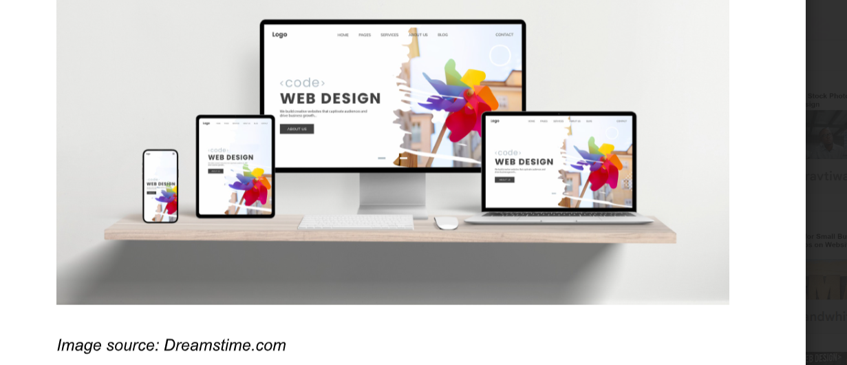
An example of a well-placed stock image in the website header
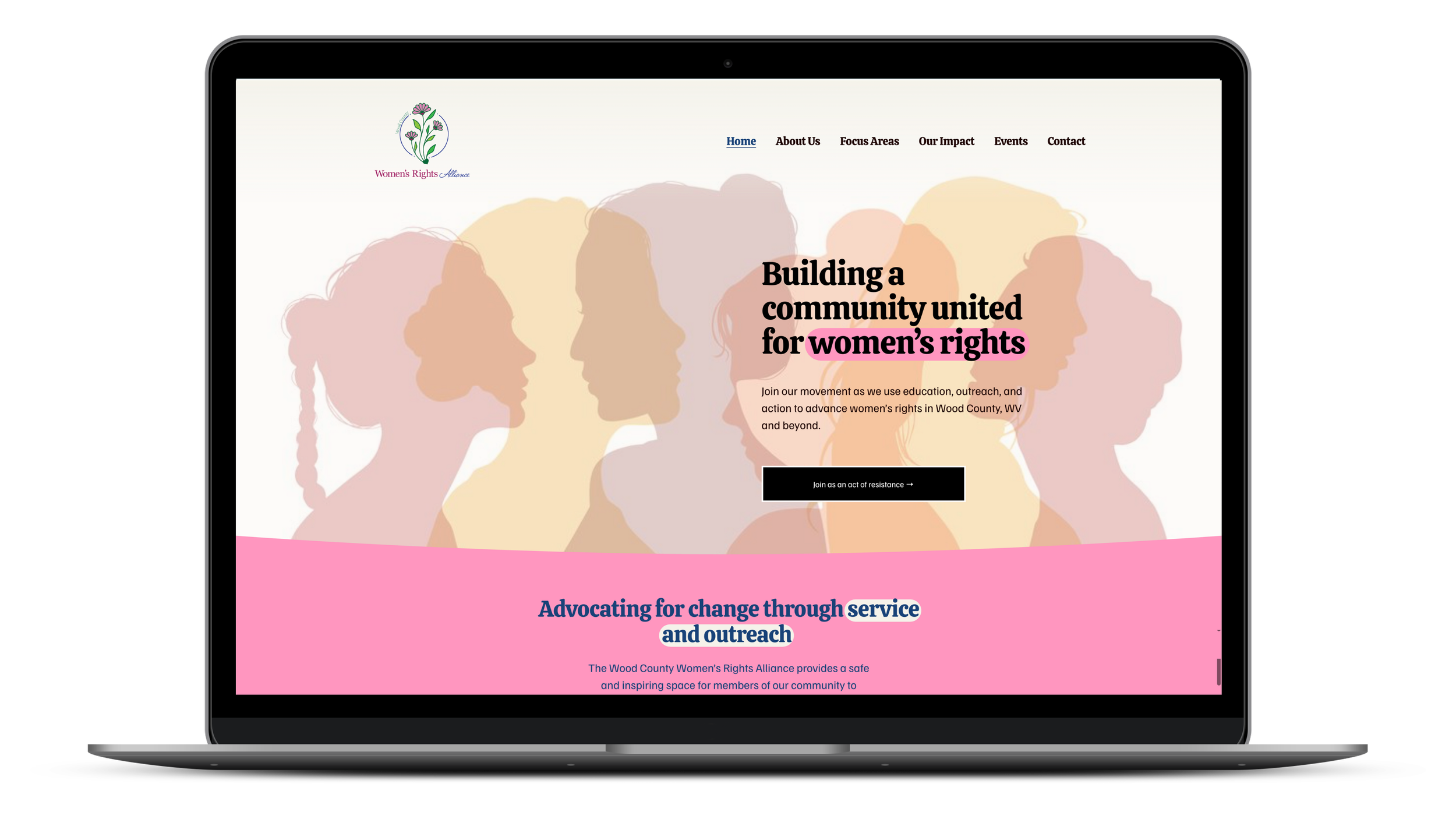
Homepage Hero Section
If there is one place where stock photography can make an immediate difference, it is the homepage hero section. This is often the first major visual area a visitor sees, and it carries a lot of responsibility. It needs to help communicate who you are, what your brand feels like, and why someone should keep exploring.
A strong hero image can instantly set the mood of the website. It can make the site feel warm, modern, refined, energetic, trustworthy, or creative before the visitor even reads a headline. This is especially useful for brands that want to make a polished first impression without relying on excessive text.
The most effective hero images work hand in hand with the page headline and call to action. They should leave room for text, fit well on mobile, and reflect the brand's audience and tone. Think of your hero image as the front door to your website. Before anyone reads a word, it's already telling visitors what kind of organization they're dealing with.
About Page
The about page is one of the most personal spots on your website, and honestly, it's where stock photography should take a back seat. People land here when they're deciding whether to trust you, connect with your story, or figure out if you're the right fit. Real photos of your team, your space, or your work will always do more heavy lifting here than any stock image can.
That said, stock photography can still play a useful supporting role when original photos aren't available or don't cover everything you need. Think of it as filling in the gaps rather than carrying the story.
or a nonprofit, that might look like using a warm community-focused image alongside your mission statement, or a photo of volunteers in action to reinforce the kind of work you do. For a small business, it could be a lifestyle image that reflects your audience, like a cozy workspace shot for a consulting firm or a craft-focused image for an artisan maker. The goal is to choose visuals that feel consistent with your values and the people you serve. Bloomerang has a helpful primer on how nonprofits can use visual storytelling effectively if you want to think through your image strategy more broadly.
Stock photography on an about page works best when it supports the tone you're trying to set, rather than substituting for the real thing.
Service Pages
Service pages are one of the smartest places to use stock photography because they often benefit from visuals that help visitors picture the context or outcome of what you offer. Service descriptions can become dense if they rely only on text. Images help create breathing room while reinforcing the message.
For example, a nonprofit focused on workforce development might use images that convey opportunity and forward momentum, while a community-based organization could lean into warm, people-centered visuals that reflect who they serve. A small business offering bookkeeping or consulting might choose something that feels organized and professional without being stiff, and a local service business might skip showing the work itself entirely and go straight to the end result the client is hoping for.
The goal is not to illustrate the service in the most literal way possible. Often, the best stock photos on service pages support the feeling or outcome associated with the service rather than just showing an obvious related object or scene. This helps the page feel more polished and gives the visitor something to emotionally connect with while reading. And if a stock photo is close but not quite right, a few simple edits can go a long way — here are six ways to edit and customize stock photos for your website without needing to be a designer.
Landing Pages and Sales Pages
Landing pages and sales pages are built to persuade, so imagery plays an important role in how convincing they feel. Stock photography can be especially useful here, as these pages often need to quickly create an emotional tone while keeping the layout engaging.
A well-placed image can reinforce the problem your offer solves, the transformation it promises, or the kind of experience your audience seeks. It can also help separate sections, make the page easier to scan, and prevent long-form sales content from becoming visually exhausting.
Because landing pages are often more focused than general website pages, the images should be very intentional. Each one should support the page's journey. One might create the opening mood. Another might reinforce trust. Another might visually support a testimonial or benefit section.
Blog Post Featured Images
Featured images are among the best and most common uses of stock photography on a website. A blog post without a featured image can feel unfinished, while a strong one can make the content look more polished, more clickable, and more shareable.
Featured images matter because they often appear in multiple places, not just at the top of the article. They appear on blog archive pages, category pages, search results, related post sections, and when content is shared via email or social channels. That gives them outsized influence relative to the space they occupy.
The best featured images are relevant to the article topic, aligned with the site’s visual style, and strong enough to stand on their own even at smaller sizes. Stock photos are ideal for this because they provide a practical way to maintain visual quality across a large volume of content.
Inside Blog Content
Blog posts themselves can also benefit from supporting stock photography, especially when the article is long. A solid image within the content can break up text, improve readability, and make the page feel less dense. This is particularly helpful for educational posts, guides, tutorials, and list-style articles.
Images inside blog content work best when placed strategically rather than simply filling space. You don’t need a photo every few paragraphs. One or two well-chosen visuals can be enough to reset attention and support the article's flow. They can also help emphasize a topic shift or introduce a new section.
When used well, stock photos inside blog posts make long-form content feel easier to navigate and more visually complete. They also help keep the site’s editorial content feeling polished rather than purely functional.
Contact Page
The contact page may not be the first place people think of for impactful stock photography, but it can actually benefit a great deal from the right visual support. Contact pages are often short on content, which can make them feel abrupt or bare when left completely plain.
A clean, fitting image can make the page feel more welcoming and reinforce the brand's tone at an important decision point. If someone has reached the contact page, they are already considering taking action. The right visual can help maintain trust and warmth rather than dropping them into a stark form-and-footer dead zone.
For example, a calm, friendly, or polished image can help the page feel approachable. A strong background or supporting image can also make the form area feel more integrated into the overall design. It is a small touch, but one that can improve the site's perceived quality.
Testimonials and Social Proof Sections
Testimonials often rely mostly on text, but visuals can help these sections feel more engaging and less repetitive. Stock photography can add warmth, mood, or context to customer quotes and trust-building content, especially when original customer photos are unavailable.
Used carefully, an image near a testimonial section can reinforce the broader outcome or emotional experience your service or product provides. For example, instead of a generic smiling face, you might use an image that reflects ease, confidence, creativity, comfort, or other feelings associated with the benefit being described. (It should go without saying here, but do not use stock photos of people with someone’s testimonial. It feels icky and will put the credibility of the testimonial itself in doubt.) Charity Navigator, the country's largest nonprofit evaluator, rates organizations in part on accountability and transparency, and your website is often the first place donors look to decide if they trust you.)
The key is subtlety. These visuals should support the trust-building purpose of the section, not distract from the testimonial itself. When done well, they help social proof feel more dimensional and visually grounded.
Product Category or Collection Pages
For e-commerce or content-rich websites, category and collection pages are another strong place for stock photography. These pages often function as hubs, helping users understand a group of products, services, or topics at a glance. A strong image can add identity to the category and make the page feel less like a plain directory.
For example, a category page for home decor, wellness products, business resources, or seasonal blog content can benefit from a visual that sets the tone for that section. This can improve browsing and add more personality to the page. It also helps distinguish one category from another without relying only on text labels.
When category pages look polished, the whole website tends to feel more thoughtfully structured.
Section Backgrounds and Transitional Areas
Some of the best uses of stock photography are not always obvious. Images can work well in section backgrounds or transitional areas between major blocks of content. These placements can add tone and depth without being the main focus of the page.
For example, a faint background image behind a call-to-action block can make the section feel more dramatic or inviting. A banner image between content sections can act as a pause in the scrolling experience. A subtle photo behind a newsletter signup area can make the moment feel more branded and less mechanical.
These uses require restraint. The images should not overpower the text or create readability problems. But when done carefully, background photography can add a lot of atmosphere and cohesion to the site.
Resource Libraries and Download Pages
If your website offers guides, templates, workbooks, white papers, or downloads, stock photography can help those resource pages feel more valuable and visually engaging. A strong image can make a downloadable asset feel more polished even before someone opens it.
This is especially helpful for businesses that rely on lead magnets or educational content. A well-chosen image can support the resource's topic and enhance its perceived professionalism. It can also help multiple downloads feel organized and distinct from one another.
On resource pages, imagery helps content look intentional rather than dumped into a file cabinet with a decorative label.
Team or Culture Pages
If you do not have enough original team photography, stock images can still help support the tone of team or culture-related pages. They should not replace real people where authenticity matters most, but they can supplement the page by reinforcing the workplace feeling, values, or client experience you want to convey.
For example, supporting visuals might suggest collaboration, thoughtful work, creativity, or community. These images can help flesh out the environment around the text, especially when the page would otherwise feel sparse.
The trick here is to use them as atmosphere rather than pretending they are literal photos of your team. When used honestly and strategically, they can still add value.
Email Signup and Call-to-Action Areas
Call-to-action sections are another excellent place for stock photography because they often need a little more energy than text alone can provide. Whether you are asking people to subscribe, make a gift, request a quote, or download a guide, the right image can make the section feel more inviting and less transactional.
A good photo can support the emotional tone of the action you want someone to take. If the signup leads to helpful content, the image can suggest inspiration or clarity. If the call to action is about booking a service, the photo can reinforce trust in the end result. Used in this way, imagery helps reduce friction and keep the page feeling human.

5 Mistakes To Avoid When Using Stock Photos
Impact comes from selectivity. Too many images can clutter a website and actually weaken the effect, so it's usually better to place strong visuals in a few meaningful locations than to spread mediocre ones across every page.
When you're deciding what not to do, keep these in mind:
Don't use an image just because a section feels empty. Empty space is not a problem that requires a photo to solve it.
Skip images that don't connect to the message. If you have to think hard about why it's there, the visitor won't make the connection either.
Avoid mixing too many visual styles. When photos feel like they came from ten different sources, the site starts to feel disjointed. And don't overlook file size — images are one of the biggest contributors to slow load times. If that's something you haven't thought about yet, this post on optimizing your images for faster page load times is worth a read.
Source your stock photos from the same place whenever possible. Paid services tend to have consistent color grading and aesthetic within their collections, which helps your site feel cohesive without a lot of extra effort.
Don't forget alt text. Every image you add to your website needs a descriptive alt tag — both for screen reader users and for SEO. It's one of the most common accessibility errors on the web and one of the easiest to fix. If you're not sure where to start, this post on fixing the most common website accessibility errors walks you through it step by step.
Final Thoughts
The best places to use stock photography across your website are where visuals can genuinely enhance the user experience. Homepage hero sections, about pages, service pages, landing pages, blog posts, contact pages, testimonial blocks, category pages, and call-to-action areas all offer strong opportunities for images to do more than decorate. They can clarify, persuade, guide, and strengthen the overall impression of your site.
When used strategically, stock photos help a website feel more professional and more complete. They add emotion to information, rhythm to structure, and polish to content. The real secret is not using them everywhere. It is using them where they matter most.
A thoughtfully placed image can do a surprising amount of work. Put enough of those smart choices together, and your website starts to feel not just attractive, but intentional.